Site Design and Theme
One-click design presets, AI theme generation from brand descriptions, shared themes for multiple sites, and visual effects turned off by default.
The color, fonts, and corner radius of your site are managed centrally through a theme, not manually on each block.
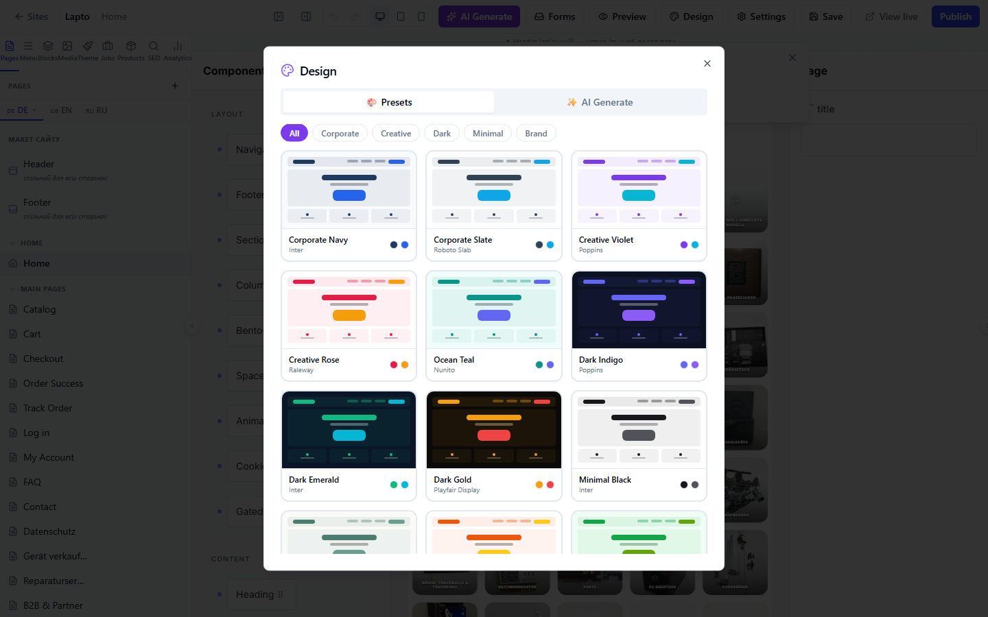
Design Presets — Quick Start
The Design button in the top builder panel opens a window with two tabs:
- 🎨 Presets — 12 ready-made design sets (each immediately sets colors, heading/text fonts, and corner styles), filtered by category: Corporate, Creative, Dark, Minimal, Brand. Click on a card → Apply Theme.
- ✨ AI Generate — Describe your brand, industry, and audience in the text field; the system will suggest 3 theme options with an explanation of why that particular color/font selection is suitable. Choose one and apply it.
Theme Panel
The sidebar for fine-tuning the current site's theme:
- If the site is connected to a shared workspace theme — the panel shows the theme name and version, a link to edit the shared theme (one change affects all sites using it), and a "Brand override for this site" toggle — allowing you to override 4 basic colors (primary, secondary, background, text) only for this specific site, without affecting the shared theme;
- One-click presets — the same gallery of ready-made sets as in Design Presets, directly in the panel;
- Effects — 6 toggles for subtle visual details:
All effects are off by default and lightweight on performance — enable them selectively, according to your brand style.